posted by Antonio Cavedoni
at
00:50
7 Comments
![]()
Finis
Dear dispatched,
this will be my last post on Dispatches from Reading for the very simple reason that I’m not in Reading anymore. In fact, I’m not even in Europe: as I write this I’m sitting on the Caltrain from Sunnyvale to San Francisco, in California, United States, headed for WWDC at the Moscone center. I arrived last saturday to my new home in Cupertino and I’ll be here until November to intern as a type designer in the Type group (Frameworks department) at Apple.
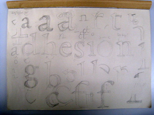
Meanwhile, on the other side of the world, my colleagues of the 2009 MATD class (of which I am still part, make no mistake) are working their butts off to finish their practical projects (typefaces) for the submission deadline of the 6th of July, and after that the deadlines for the reflection on practice, the workfile and, lastly, the final dissertation submission on the 17th of September. My workfile is done but my practical project is far from it and I’ll be putting the “final” touches to it from here. I will also write my dissertation over the summer, I hope to make it in time for the deadline. I did most of my research already and I have my room here in Cupertino full of books and articles. I have very good material on my hands and I hope to do it justice by not rushing my writing too much.
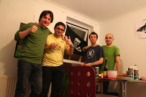
Back to Reading: the weeks before leaving the UK have been very intense. We had a lot of visitors to the department, lectures, reviews etc. We did the usual MATD trip to the Low Countries and it was really a blast meeting one to one with all these typographic monuments (just a sample: Robert Granjon’s Ascendonica italic original punches! Nikolas Kis’ Armenian and Georgian types, with handwritten notes on top! Original drawings from many typefaces by Jan van Krimpen, Gerard Unger, Bram de Does!). We also had dinner at Thomas Milo’s place in Amsterdam and at Gerard and Marian (and Juanita) Unger’s place in Bossum, great food, great people!
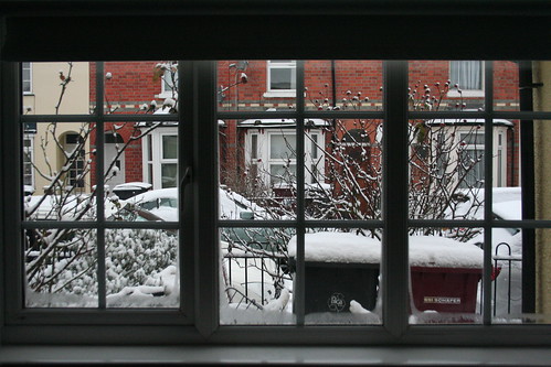
And of course I had a lot of goodbyes to say. I will miss the walks by the Thames, the ales, the grill parties, the easy access to so many awesome typographic resources in the department and beyond, but most of all I will miss the people from all over the world with whom I shared this crazy ride. Thank you, guys and girls!
I will do my best here, and I will be in good company: there’s more than 400 other interns this summer working on all sorts of interesting stuff from the iPhone to OS X to UI design to accounting & finance to the iTunes store, etc.
To wrap up this post: thanks for following along these Dispatches from Reading, I will keep people posted with a new series of Dispatches from Cupertino – I don’t know yet in which form or language.
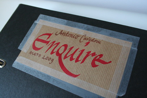
I also look forward to check out the work of next year’s MATD students, and be sure to drop me a line when our own work will be up on typefacedesign.org sometime in July, I would really appreciate to have your feedback on my Enquire family.
Cheers!