Monday, 28 July 2008

Design for programmers

Apri/chiudi

Two weeks ago I was asked by Marco Beri over at Link IT (we’ve been working together on a huge project, but I’ll write more about it later) to hold a workshop on (Web) design for programmers. I thought that an approach too close to the current Web technologies would have been useless in the long run, so decided to talk a bit about design principles and then apply them to the Web, by dividing the people in groups and having them redesign a single Web page, then present it to the other groups during the critique session.

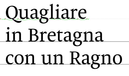
Most of the material I presented in the morning came from a book which I consider truly fundamental, but which is unfortunately out of print and impossible to find. I don’t even have a copy myself, I used Francesco’s copy. The book is called Trattato di Architettura Tipografica by Carlo Frassinelli (yeah, in Italian – again), published in 1944, but I had the 1956 edition. It’s all about basic typographic principles, but the clarity of exposition, the quality of the examples, and the coherence of the whole make it really outstanding from all the other design books I’ve read. This example comes straight from the book:

contrasto: è necessario contrastare per ottenere l’evidenza di una lettera o parola racchiusa in un dato spazio

I truly believe typography is the basis of design for the Web (and not only…), and Frassinelli helped immensely in explaining that. The workshop went well, I’ve been asked to do two more days on typography and layout in september, before I leave. Nice!

Marco and Carlo

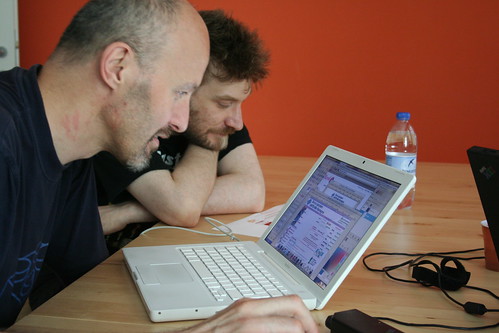
This Flickr set has all the images on the workshop.

What does all this have to do with Reading? One of the first things Gerry told me when putting together my portfolio before applying for Reading, was that they where interested more in ways I had been using type, rather than at specific samples of type design I did. This is because you can’t draw good type if you cannot foresee how it will be used, to a certain extent, so a solid knowledge of applied typography is fundamental. I hope I strengthened a bit more my understanding of the basic principles during the workshop, and I sure hope I was able to transmit them to the people attending!

Pretty pilcrow

I just refreshed this site’s stylesheet, it looks less Blogger-ish now and tweaked a bit the typography.

Pilcrow

I’ve been reading two new books on typography. The first is Robin Kinross’ Modern Typography, on which I’ll report once I’ve finished it, the other is Lucrezia e Paulina by Adriano Filippetti and Francesco Mantovani. It’s a book (in Italian, sorry guys) about Francesco Griffo da Bologna’s work with scholarly research, very well written, and the digitalization of two typefaces:

  • Paulina by Adriano Filippetti which has a roman and italic cut, and comes from the book Paulina, de recta paschae celebratione: et de die passionis domini nostri Iesu Christi, written by Paulus de Middelburgo and published by Ottaviano Petrucci with a new roman type cut by Francesco Griffo in 1513 in Fossombrone, Italy.
  • Lucrezia by Francesco Mantovani, which is an italic-only typeface with upright capitals inspired by the work of Francesco Griffo and other chancery scripts from the late 15th/early 16th century.

As I said, the bit that I enjoyed the most are the two historic introductions about the work of Ottaviano Petrucci and his collaboration with Francesco Griffo, and on the italic scripts from the Renaissance. The typefaces are well drawn, but I can’t comment too much on them because unfortunately the book doesn’t present them too well as far as samples go.

The Paulina typeface has a nice form of pilcrow which I redrew as an excercise and that might end up in the alternate set for Rest: you can see it at the top of this post (or more in detail on my Flickr space).

If you are interested in the life and works of Francesco Griffo da Bologna and can read Italian I highly recommend this book, which can be bought from AIAP.

Friday, 25 July 2008

Pretty words

Gerry sent us a list of books and articles to read during the summer. Fortunately, my friend Claudio has all the Eye articles I need, and Julia is chasing the Visible Language ones as well, so I guess I’m all set.

I need to get hold of Rosemary Sassoon’s Computers and typography two books then I’m done. The IELTS results haven’t been mailed neither to me nor to Reading, so I phoned them yesterday and asked what’s up. Hopefully that will get sorted next week.

I’ve been a bit slacking off with my typefaces in the past two weeks (fixed a bit Rest’s numbers and been mulling over a sans version, but that’s about it) because work has been getting in the way, bigtime. I did manage to sneak in some type and lettering work, though:

Lekton

I drew several glyphs for Lekton, which is a free typeface: you can download and use it in any way you want, but don’t try to re-sell it. It was drawn mainly by Luciano Perondi and his students in Urbino, but me and Marco contributed some glyphs to the original .vfb file. This is the § glyph I drew for Lekton:

Lekton §

Italic 2.0

I co-wrote two articles on Italian typographic history and two sections on typography and programming for the book Italic 2.0, which will come out in Italian, English (and Russian, I’m told!) in October, that has kept me quite busy. Nothing to show yet, sorry.

Scrive

I drew this piece of lettering for Scrive, an Italian web site/service ran by a friend of mine, Claudio Cicali:

Scrive, two versions

We decided the top version without the iv politype was more readable, so it went online.

BlogBabel

Another friend of mine, Ludovico Magnocavallo, is running BlogBabel, an aggregator for italian weblogs, so I helped him with the logotype. It is set in a new typeface I have been drawing in spring, codenamed Berto, which has a full range of weights already and has a ginormous x-height in order to facilitate MixedCase settings.

BlogBabel

And that’s pretty much it!

The title of this posts refers to a song Julia sent me called Pretty Words by a band called Tindersticks.

Friday, 11 July 2008

Actually reading (ree-ding, as in –with my eyes)

Today I finally got in the mail my copy of Edward Johnston’s masterpiece Writing & Illuminating & Lettering. Unfortunately I have the 1980 Pitman edition, which appears to have been reduced photographically. The illustrations and type suffer a lot from this reduction, but the content is so good I’m pretty willing to get over it. And since it wasn’t really that expensive I can always “upgrade” to a better, proper version later.

I’ve been wanting to read this book for a couple of years now, and I seem to recall it being in Gerry’s reading list for the MATD. I’ll have to check once he mails in the new version of the list, which should happen right after TypeCon.

Meanwhile I managed to make contact with another prospective MATD student hailing from Germany: Julia Kaestle is a student of arabic calligraphy and just today she published a wonderful article over at I love typography which I found very insightful, especially since she places arabic calligraphy in the context of a typographic excercise.

Rest, REST and ReST

In case it wasn’t clear from my home page I’m quite a geek. While mentioning Rest, the typeface/excercise from last week, I forgot to mention it was of course named after pretty geeky stuff, apart from the other reasons. I’ll spare you the details but for those who get the joke I just wanted to point out this must be the first RESTful typeface in existence (down with the WS-death-*!). I’m not much into the other ReST, but since it’s such a big thing in the Python community, and Python is my programming language of choice of the moment, I thought it was worth mentioning as well.

Enough!

IELTS 8

According to this IELTS form (which is so bad I felt compelled to scribble down some notes on what I think is wrong with it), I passed the IELTS academic test with a score of 8. The university of Reading requires at least a score of 7 to enter the class, otherwise one would have to take language lessons – for a cost – while in Reading.

The whole IELTS experience has been terrible. At first I tried avoiding it by qualifying my knowledge of English in my application form: I’ve been studying English since I was in secondary school, took exams at the university, lived in the UK for six months during my Erasmus in Bristol, worked for a company in Bath for 5 months, been reading and writing English daily since I’ve been in business – almost ten years, etc.

That was not considered enough though, they really wanted me to provide evidence so I had to take either the TOEFL or IELTS test. I was told by Emanuela (currently attending the MATD) that the IELTS was slightly preferred, so I enrolled for that. After a clumsy application procedure – their Web site doesn’t work – I had to resort to a postal payment, something I hadn’t been doing in almost twenty years. I then faxed (yes) all my papers and sent some of them by email too (never got a single reply or notice of receipt).

Material for preparing for the IELTS test abounds on the Web, unfortunately most of it is for pay. I gave a cursory glance to what kind of tests we had to attend then decided it wasn’t worth preparing for, in the sense that the tests always change but once you understand how they work I think you’re pretty much done. Apparently they have some known criteria for marking your tests, like giving you extra points if you have an introduction and conclusion in your written essays, etc.

I thought it was silly to try to reverse-engineer the tests and decided to try and just walk there and do the best I could. They’re testing my knowledge of the English language, not of the IELTS test, after all (or so I thought).

The test was on the 28th of June in Bologna, at the Associazione Culturale Italobritannica. I had to wake up at 6 AM to be there in time since they required you to be there by 8:45 AM or so. The room I was assigned to had the air conditioning system broken and we couldn’t open the windows because the first test was a listening test and the road noises outside the window would have made it a nightmare. Humidity was incredible, I felt like I was in Hanoi in one of the Vietnam War movies!

I would also say the people running the test where pretty rude to us but thinking back to it I just think they where trying (too hard) to be very strict about following the rules, ending up in some pretty comic situations. They where just doing their work anyway, and it’s not like I was forced to enroll so I don’t think I can complain too much on this one.

By the way: people, remember to write down somewhere, somehow your candidate number, even if you aren’t allowed to bring paper or anything with you during the test. Without it you won’t be able to check your results online. But to be honest that won’t be much of a problem, since checking the results online is a nightmare anyway. Better to just wait for the results in the mail, eventually.

And that’s it, IELTS done, score 8: I messed up the listening test pretty hard, 7.5, and I don’t know or care why but the writing test was pretty bad as well, 7.5. I did well in the reading test, 9 (how fitting!) and OK in the speaking one, 8.

Reading, here I come!

Tuesday, 8 July 2008

Aiming high

As I was saying in my previous post, why not aim high in excercises? Below, Rest trying to keep up with none other than Francesco Griffo da Bologna himself (and not doing a good job of it, of course):

As I wrote on the Flickr caption, the above is a quote from the Hypnerotomachia Poliphili set in Rest, stylistic set 1.

Since my kerning is not yet done, I used InDesign’s optical kerning (and it shows, many combinations like QVA are way too tight). The stylistic set includes a Q with the long tail, an M without the upper-right serif (as seen in Griffo’s De Aetna type) and open-bowled P. S looks a bit too short and maybe too wide and heavy. Q and O should be more round by Griffo’s standards. I used to have a long-tailed R but removed it at some point, maybe I should bring it back for all caps settings like these.

Update on the previous point: yesterday night I drew an alternate R with epigraphic capitals proportions and contrast – to a certain extent. This:

R

Now, when I say I’m trying to keep up with Griffo I don’t mean I’m trying to replicate his lettershapes or proportions in Rest. That’s a fun project for sure, but not this one. And I am also quite skeptical of “literal” revivals of metal typefaces: of course you can chase the grace and the impression on page of a typeface, but apart from that I think you’re chasing the impossible as technologies are drastically different and needs and usages have changed too (so that would make for a pretty unpractical typeface).

Anyway: fun fun fun!

Monday, 7 July 2008

Resting for Reading

Rest

As an excercise for Reading I’ve been drawing a text typeface for the past few weeks. I started two sundays ago and sort of never stopped working on it (by night, since by day I’m at work). Yesterday night I gave a first try to a set of numbers, while on saturday I played with ligatures and a first stylistic sets with some uppercase letters that resemble the ones cut by Griffo for the Hypnerotomachia Poliphili. Yeah, a bit pretentious, but if you don’t aim high in excercises where are you supposed to do it?

I’ve never drawn a text face before, so getting the contrast right was tricky, and I’m definitely not done with it. So far the feedback has been positive, I think I might be able to finish a first cut of the roman and of the italic before the end of the summer.

The typeface references a number of text faces that I currently like: Bram de Does’ Lexicon (stroke endings, asymmmetrical serifs in k, v, w), Underware’s Dolly (lowercase s, a bit of the serif structure), Giovanni Mardersteig’s Dante (especially the uppercase E) and many others. While it does not aim to be innovative in any way (my aim at the moment is just to make it work properly) I think it’s starting to work.

Rest, photographed by Juan Pablo de Gregorio

I decided to call it Rest: this summer is pretty hot and humid here in Sassuolo/Modena and I had a lot of problems sleeping so Rest is what I need at the moment. Of course that’s not the only reason for the name!

Friday, 4 July 2008

First welcome

Yesterday we received a “First welcome” email from Gerry, with info on how to reach Reading, when the term starts, how to look for accomodation, insurance and healthcare matters. He sent the email to all of us, sharing our names and email addresses, so it looks like we all rushed to find out who the other MATD 08/09 students where. I eventually managed to make contact with Gro, Jon, Marian and Anette. I already knew Eben from Typophile, so that brings the count of people I “know” (for some values of know) to 5 out of 13. I started a Facebook (eek!) group for all of us, but many haven’t yet checked in and I’m not sure about its usefulness. I guess we’ll see.

I also got an email from Gerry about accomodation. I opted to stay in one of his flats, the Foxhill one, as I didn’t fancy going around Reading chasing dodgy rooms full of undergrads living the high life. I also heard good things about Foxhill and I kind of like the idea of having people doing what I’m doing around me: that means they (hopefully) won’t throw parties while I’ve got an essay deadline to meet, at least.

I’m still hating Blogger. I’ve been thinking to other alternatives I can install on my server like ExpressionEngine, but being PHP I’m kind of wary of using it. I could whip up something quick in Django/Python, but then I’d have to move it away from this server to run Django trunk comfortably. I’ll see what I can do.

Wednesday, 2 July 2008

Blogger, please quit fiddling with my HTML

Not sure I’ll be able to resist pruning Blogger for good, it deals with my HTML in ways I don’t like (adding style="" crapola everywhere, meh).

I’m readying!

Hello there, my name is Antonio Cavedoni and this is my Reading weblog. Reading in the sense that I’ll be moving to Reading, UK, in late September, to attend the MA in Typeface design at the University of Reading. Readying because I decided to start documenting my year abroad before leaving, as I already received several questions from prospective students for next year’s batch.