Unger Workshop
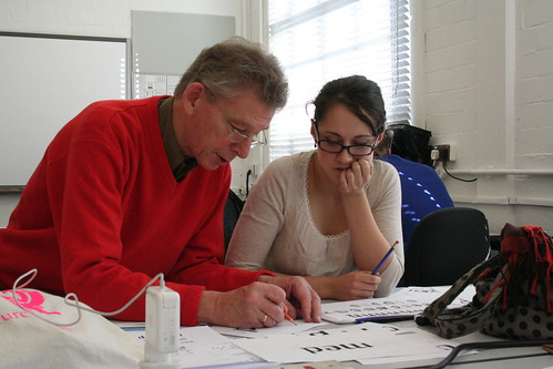
The first few weeks of the course we where all waiting for the drawing to start: on tuesday Gerard Unger came to Reading to hold our first practical workshop. The week was very intense, I’m presenting here my excercises and results.
The first morning Gerard showed us some material then proceeded asking us to start thinking about how to design typefaces for continuous reading on a mobile phone screen. He said we should think about it, sketch, then have a first “smoke proof” (my words, not his) by inking our drawings, photocopying and reducing them. I thought it was a bit awkward to proceed in this way, because if you want to design a typeface for screen you should really be doing it, you know, on screen. I then understood that Gerard wanted us to think more about the process than the result, especially for those of us who had never put together a typeface before. With that in mind, I set out to work on some sketches for a generic low-resolution typeface.
I thought I would make a typeface with very low contrast, huge x-height and very short descenders and ascenders, and experiment by making the connection between the curves and the stems very contrasted. This idea is pretty popular at the moment in the form of ink traps, but I tried making it even more experimental by introducing an idea used by Simoncini in his Selene newspaper typeface (I’ll talk about Selene, Simoncini and my research on it much more at length later on).
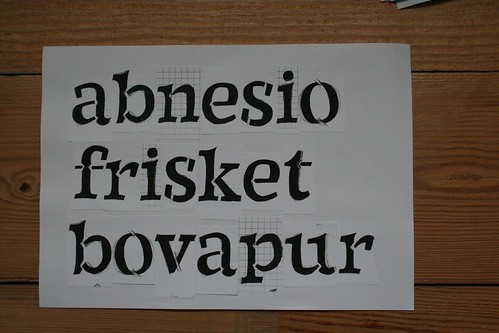
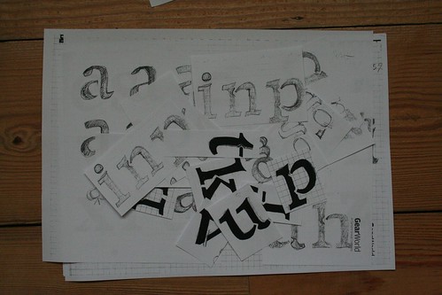
As for the style of the typeface, I experimented with several lowercase as before settling on one I thought would be appropriate and resistant enough, by making some experiments with reduction with the photocopier. I then drew many other glyphs in order to compose some test words, photocopied, inked them and finally pasting them together:
I probably designed my cuts too narrow, so on Gerard’s suggestion I tried to see if I could remove them or make them more visible to see how they would perform. I experimented with reducing them to “regular” ink traps or filling them in completely, looked from a distance, squinting, etc. then I proceeded with digitizing my drawings.
While digitizing I also tried making the connections from the curves to the stems very spiky, then producing more extreme versions of my cuts and bites and combining these with the spiky connections by making the typeface a multiple master. That way I could produce variations and see how they would perform side by side at various sizes. At this point I wasn’t thinking of screen rendering anymore (although I kept an eye on it in FontLab) but was trying to get at least a good printout from the laser printer in the MA room, which was driving me insane.
And that was it: in four days I produced a whopping 17 glyphs typeface with two Multiple Master axes (Cuts & Spikes) and conducted some experiments on how you can distort a letter before it becomes unusable. Although I’m aware that the fitness for purpose of this typeface is questionable at best (it didn’t go anywhere near a mobile phone screen!) it made me reflect on what it is to actually deal with distortion in your letter shapes, how the photocopier and the laser printer and the screen do completely different things to your letters and on possible strategies to try and counter it.
I also had a lot of fun at first drawing, inking, photocopying, pasting, etc. although I must admit it got tedious incredibly fast, because I’m just so much more productive in FontLab it doesn’t even compare.
Bonus track: when cutting and pasting my letters, I basically had a type case of letters I had designed and I actually had to manually kern some of them to make them fit. Kerning by scissors, insane fun!


3 Comments:
Great post, Antonio. It's fascinating to glimpse inside the program.
kerning by scissors fun? you are a sick, sick man!
Hey, I have been following this blog from before you got to Reading, and I must say thanks! It's great to actually know what's happening. I want to attend more and more.
Btw, this post absolutely convinced me! You guys are looking like you're having a blast!
Post a Comment
¶ Home