Design for programmers

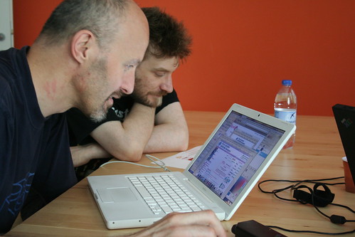
Two weeks ago I was asked by Marco Beri over at Link IT (we’ve been working together on a huge project, but I’ll write more about it later) to hold a workshop on (Web) design for programmers. I thought that an approach too close to the current Web technologies would have been useless in the long run, so decided to talk a bit about design principles and then apply them to the Web, by dividing the people in groups and having them redesign a single Web page, then present it to the other groups during the critique session.
Most of the material I presented in the morning came from a book which I consider truly fundamental, but which is unfortunately out of print and impossible to find. I don’t even have a copy myself, I used Francesco’s copy. The book is called Trattato di Architettura Tipografica by Carlo Frassinelli (yeah, in Italian – again), published in 1944, but I had the 1956 edition. It’s all about basic typographic principles, but the clarity of exposition, the quality of the examples, and the coherence of the whole make it really outstanding from all the other design books I’ve read. This example comes straight from the book:

I truly believe typography is the basis of design for the Web (and not only…), and Frassinelli helped immensely in explaining that. The workshop went well, I’ve been asked to do two more days on typography and layout in september, before I leave. Nice!
This Flickr set has all the images on the workshop.
What does all this have to do with Reading? One of the first things Gerry told me when putting together my portfolio before applying for Reading, was that they where interested more in ways I had been using type, rather than at specific samples of type design I did. This is because you can’t draw good type if you cannot foresee how it will be used, to a certain extent, so a solid knowledge of applied typography is fundamental. I hope I strengthened a bit more my understanding of the basic principles during the workshop, and I sure hope I was able to transmit them to the people attending!


0 Comments:
Post a Comment
¶ Home