Resting for Reading
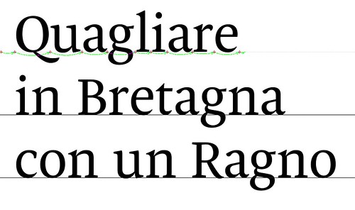
As an excercise for Reading I’ve been drawing a text typeface for the past few weeks. I started two sundays ago and sort of never stopped working on it (by night, since by day I’m at work). Yesterday night I gave a first try to a set of numbers, while on saturday I played with ligatures and a first stylistic sets with some uppercase letters that resemble the ones cut by Griffo for the Hypnerotomachia Poliphili. Yeah, a bit pretentious, but if you don’t aim high in excercises where are you supposed to do it?
I’ve never drawn a text face before, so getting the contrast right was tricky, and I’m definitely not done with it. So far the feedback has been positive, I think I might be able to finish a first cut of the roman and of the italic before the end of the summer.
The typeface references a number of text faces that I currently like: Bram de Does’ Lexicon (stroke endings, asymmmetrical serifs in k, v, w), Underware’s Dolly (lowercase s, a bit of the serif structure), Giovanni Mardersteig’s Dante (especially the uppercase E) and many others. While it does not aim to be innovative in any way (my aim at the moment is just to make it work properly) I think it’s starting to work.
I decided to call it Rest: this summer is pretty hot and humid here in Sassuolo/Modena and I had a lot of problems sleeping so Rest is what I need at the moment. Of course that’s not the only reason for the name!


2 Comments:
nice work, looks really promissing!
Thanks, Fernando!
Post a Comment
¶ Home