Thursday, 30 October 2008

Arabic Workshop

This week we had the Arabic workshop with Fiona Ross. We started on tuesday with an introduction to the script and especially Fiona’s experience in managing the design and production of Arabic typefaces for Linotype, through the case history of the re-development of Yakout by Tim Holloway, and the several steps of revision they went through. We also started drawing right away, to get a feel for the shapes and get acquainted with the Arabic script. The first day ended with some of us going to see the La graine et le mulet, a French movie about some arab expatriates in France.

The day also the weirdest in Reading so far, weather-wise: I went to the department in the morning without my jacket because there was a wonderful sunny sky and it was quite warm, then it started to rain (cats and dogs!) in the afternoon. The high point was reached when coming out from the movie: it was snowing!

Snow in Reading!

The second day of the workshop was spent mostly drawing and sketching, with a lecture by Yannis Haralambous in the afternoon on the nuances of Unicode, OpenType, how typefaces actually work from a technical point of view, what are the problems involved in developing typefaces for complex scripts like Arabic, and how computers deal with them, TeX, and other geeky things. It was very intense and very challenging to follow Yannis’ super-sharp mind as he was explaining these concepts – which I admit I though I had a much better understanding of that it turned out to be the case.

Arabic calligraphy excercises

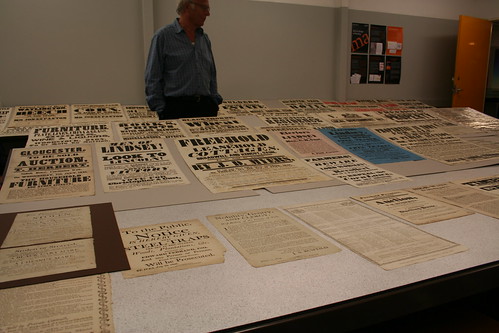
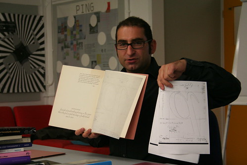
Today we mostly kept on sketching and looked with Fiona at other issues related to Arabic typeface development, starting from calligraphic/lettering sketches and then going to the computer. We also did a class evaluation of several Linotype typefaces together, to see how our understanding of Arabic shapes was developing. The workshop ended with Fiona showing us some of the materials in the department collection and giving some feedback on our sketches.

All in all it’s been a great ride. While I can’t claim to know very much about the Arabic script, I certainly learned a lot this week: I now know some of the pitfalls and major problems in developing an Arabic typeface, and can identify and reproduce some of the glyphs needed.

By the way: many thanks to Deema, our classmate from Saudi Arabia. All the time I was sketching and I couldn’t figure out for the life of me what I was writing of it was even readable, so I used her eye to help me during these three days. Thanks!

Tuesday, 28 October 2008

Phileas

It traveled from Shangai (China) to Incheon (Korea) to Warsaw (Poland) to Köln (Germany) to Apeldoorn (Netherlands) back to Köln (Germany) to Stansted (United Kingdom) and finally to Reading. Ladies and gentlemen, let me introduce you phileas, standing side by side with my former laptop, oscar:

phileas and oscar side by side

It has a good feel to it, the new trackpad is very nice and with the help of Migration Assistant I was back in business in about two hours – lovely. The screen is very reflective but I guess I’ll get used to it. Let’s get cracking!

I’m off to Fiona Ross’ Arabic workshop.

Saturday, 25 October 2008

Unger Workshop

BHOLD UNGER TYPE WK

The first few weeks of the course we where all waiting for the drawing to start: on tuesday Gerard Unger came to Reading to hold our first practical workshop. The week was very intense, I’m presenting here my excercises and results.

Gerard and Émilie

The first morning Gerard showed us some material then proceeded asking us to start thinking about how to design typefaces for continuous reading on a mobile phone screen. He said we should think about it, sketch, then have a first “smoke proof” (my words, not his) by inking our drawings, photocopying and reducing them. I thought it was a bit awkward to proceed in this way, because if you want to design a typeface for screen you should really be doing it, you know, on screen. I then understood that Gerard wanted us to think more about the process than the result, especially for those of us who had never put together a typeface before. With that in mind, I set out to work on some sketches for a generic low-resolution typeface.

I thought I would make a typeface with very low contrast, huge x-height and very short descenders and ascenders, and experiment by making the connection between the curves and the stems very contrasted. This idea is pretty popular at the moment in the form of ink traps, but I tried making it even more experimental by introducing an idea used by Simoncini in his Selene newspaper typeface (I’ll talk about Selene, Simoncini and my research on it much more at length later on).

As for the style of the typeface, I experimented with several lowercase as before settling on one I thought would be appropriate and resistant enough, by making some experiments with reduction with the photocopier. I then drew many other glyphs in order to compose some test words, photocopied, inked them and finally pasting them together:

pasted and inked

I probably designed my cuts too narrow, so on Gerard’s suggestion I tried to see if I could remove them or make them more visible to see how they would perform. I experimented with reducing them to “regular” ink traps or filling them in completely, looked from a distance, squinting, etc. then I proceeded with digitizing my drawings.

base version

While digitizing I also tried making the connections from the curves to the stems very spiky, then producing more extreme versions of my cuts and bites and combining these with the spiky connections by making the typeface a multiple master. That way I could produce variations and see how they would perform side by side at various sizes. At this point I wasn’t thinking of screen rendering anymore (although I kept an eye on it in FontLab) but was trying to get at least a good printout from the laser printer in the MA room, which was driving me insane.

And that was it: in four days I produced a whopping 17 glyphs typeface with two Multiple Master axes (Cuts & Spikes) and conducted some experiments on how you can distort a letter before it becomes unusable. Although I’m aware that the fitness for purpose of this typeface is questionable at best (it didn’t go anywhere near a mobile phone screen!) it made me reflect on what it is to actually deal with distortion in your letter shapes, how the photocopier and the laser printer and the screen do completely different things to your letters and on possible strategies to try and counter it.

I also had a lot of fun at first drawing, inking, photocopying, pasting, etc. although I must admit it got tedious incredibly fast, because I’m just so much more productive in FontLab it doesn’t even compare.

my type case

Bonus track: when cutting and pasting my letters, I basically had a type case of letters I had designed and I actually had to manually kern some of them to make them fit. Kerning by scissors, insane fun!

Sunday, 19 October 2008

Ersatz

The new word for today is ersatz. I was reading the article Future Tendencies in Type Design written in 1985 by Hermann Zapf in Visible Language, volume XIX number 1, and he wrote:

Janson is a typical seventeenth century typeface and should be respected as an original design of this historic period in the Netherlands. It was created out of the spirit and artistic background of that time. The Janson is, in my opinion, not at all an espression of the alphabet in the twentieth century. […] It is possible to design something new within the structure of the Janson, but we should leave the foundry design alone and create a new Janson, not just make an ersatz design.

According to Wikipedia, ersatz is a German word literally meaning substitute or replacement.

The Secret Society

The forces of evil have been summoned to create a new, secret society for typeface design students. Dices have been rolled, bits have been flipped, everything is ready for the deployment of the new .org-anization. Hints about its evil identity are scattered all over the place. Keep your doors locked, your serifs bracketed and your mouths shut about it, because it’s definitely coming!

Friday, 17 October 2008

A Minor Miracle

When I was in primary school I didn’t mind learning how to write. I remember I hated colouring stuff, so much so I used to take back homework to my teacher saying I used to prefer it in black and white (and get a note for that). But writing was OK. I wasn’t great at it, and I later found out that I had learned to make all the loops in my round shapes in clockwise direction, which is the opposite of what you want when writing in the style they teach kids in Italy, which is some sort of simplified English roundhand. I remember at one point playing with my handwriting, I must have been six or seven, trying to condense it horizontally or to expand it, and sticking with these experiments for weeks on end.

I realised all my double clockwise loops where way too time consuming and hurtful for my wrist when I was in secondary school, and then moved onto high school and university. I was quite quick at writing, but I couldn’t for the life of me figure out what I had written, when trying to decode my notes back at home. That eventually became a problem in high school, when I had to re-read all my essays to my professors because they couldn’t quite decipher anything of mine. When I went to university I had already pretty much given up on my handwriting. I think I have a pretty good sense of shapes, alignment and space on the page, but the signs themselves where messy and just impossible to read. My first university exam was a written one; I was in a class with 150 other students (oh yeah!) and the professor walked in to announce the results. He said it took him a long time to go through all the papers, and that in one case he just had to give up because the handwriting was so bad. Guess who’s paper that was?

As a last resort I sort of tried migrating to all caps when I had to write short notes, but as anybody who knows a bit of calligraphy, ALL CAPS is not really meant to be written with a pen, so that somewhat makes matter worse. It’s also way more slow than proper cursive, because all the shapes are separated and you’re always raising the pen and going back to the paper, then again and again.

Enter my love/obsession for typography at about the age of 20, just after entering university. I just loved looking at the shapes and I found I was quite good at keeping them in my head, recognising them back once I saw them, noticing the nuances and details. It just frustrated me that with my poor handwriting – and drawing skills, I must add – I would never be able to do any of that on my own. I felt I could look at type, but I wasn’t allowed to make it, I felt like an outsider.

For some reason, three years ago I started thinking back at designing type, I just couldn’t get it outside my head. I started redrawing with bezier paths on the computer old, dead typeface from Italian foundries. I remember sending over to my friends a screenshot of a lowercase a in FontLab: the point placemenet was all wrong and the proportions didn’t quite match, but guess what? It was there! I then drew more and more, but still strictly on the computer. At the beginning of last year I had had enough of my handwriting inferiority complex and decided to enrol in a calligraphy class with ACI (Associazione Calligrafica Italiana). My teacher, Francesca Biasetton, taught me the basis of the Cancelleresca script, a beautiful Renaissance handwriting style that few people practice today in Italy, and fewer use it as an everyday handwriting.

experiments in cancelleresca

My first experiments sucked, of course, but I was really surprised: I wasn’t as bad as I planned, I could do it! That was a revealing moment for me. After that, I started drawing and drawing and drawing every day, with all sorts of pens and quills and pencils, trying different styles and methods, then digitising my drawings and restart again. I’m not a great calligrapher by any means, but my handwriting now is reasonably readable, I can fake many writing styles and make things look pretty and neat. And I can also play with the shapes regardless of the tool, which is the key to proper type design.

I can’t quite explain why I felt having a good handwriting was a requisite for being a type designer – it’s not – but probably it was just a self-challenge I had to overcome in order to start pursuing this new interest/passion.

I understand this might sounds like nothing to you, but to me it feels like I experienced a minor miracle. And the best part is that it’s still going on as I get more and more practice!

Tuesday, 14 October 2008

Being There

a tree on the Reading campus

Everybody says Reading is at its most beautiful at the beginning of autumn, before the long, dark, grey winter. I’m now enjoying every minute of sunshine and generally still trying to get a feel for the place. It’s the second week of lessons now, the third since I arrived from Italy, and things are looking great so far. I finished last week by taking a short break off to London. I hadn’t been there since five years and I found it much better! I made a visit to a very nice design studio near Old Street, then I went out for a pint and some sausages and mashed potatoes with Matte, who I hadn’t seen in ages.

me in London

This week started with the first Michael Twyman lecture. Michael set up the typography department, and even though he’s retired now he still comes in every monday to show items from his huge, amazing personal collection, to challenge the minds of us MA students. It was brilliant.

Michael Twyman, first lecture with us in the dept

I stayed for another hour after class looking at the samples he brought in, then in the evening I started the Foxhill Drawing Bureau with Camille and Gesine: we would pick an image from the ones I shot, then redrew some bits that interested us and then some. Really fun!

Today we had another lecture with Gerry about the influence of the tools on letterforms and then a wonderful lecture from the visiting Alastair Johnston on Richard Austin (both of them, father and son). Tomorrow Fiona will introduce us to the resources in the department, then we have a letterpress workshop on thursday and then we’re off for the weekend. Next week: Gerard Unger!

Oh, and tomorrow I’m ordering my new laptop, so that should be cool as well. What can I say, I’m having a blast so far!

The title of this post refers to the Peter Sellers movie Being There which we saw over at Claus’ place two days ago – and which I loved.

Friday, 10 October 2008

Polaroid

A quickie: I’m heading to London to meet people. Tonight with Matteo we’ll be on Polaroid, an Italian radio show in Radio Città del Capo at about 8:30 PM (BST) or so.

Tuesday, 7 October 2008

First lecture

Today we walked to the department (under the rain) and had our first day of lectures after yesterday’s IT briefing. We had James Mosley talk about the history of letterforms and Gerry Leonidas to talk about the course, the reading list and in general how Reading approaches typography and research in this field in general.

Gerry & Dwiggins

The picture above is Gerry showing us an original of the famous Dwiggins letter, and comparing to a printout from a PDF. The point he was trying to make is that seeing this stuff with your own very eyes is completely different than seeing a reproduction, and that the MATD course will be a very hands-on experience for us, especially with the wealth of material that’s in the department, which we will go through in due time.

Yesterday night we went to the postgraduate party – which was OK – then came home and had some real fun with Claus, Émilie, Camille, Gesine and Eben until 3 in the morning, trying not too make too much noise because of the neighbors. This is a great way to start the first week!

Thursday, 2 October 2008

Do Me a Flavour

I’ve been in the UK since last saturday but I’m still trying to find my way around this place. I’m living in a shared apartment in Foxhill road: me, Camille (French) and Gesine (German) call it “the small flat with the BIG personality” because it’s tiny, but it’s also a really cozy place.

Right now I’m on the couch checking email and stuff with Camille and my laptop is just so noisy it’s driving me mad, I hope to get a replacement really soon. Apart from it, I sorted some of the tasks for this week like getting the student card but didn’t quite manage to sort out the bicycle issue (me, Gesine and Camille want one but it’s difficult to find second hand bikes in town). I was thinking about sports stuff for a change, but I’m way too lazy.

We also had the first introductory welcome meeting to the department yesterday, where we got to know each other a bit better and got some security information and a general introduction to how the course it’s gonna be. The outcome is that we’re all very excited of starting but also somewhat scared at the sheer quantity of stuff we’re supposed to work on. But hey, that’s why we’re here in Reading!

Yesterday we also had Claus, Amélie, Gro, Eben and Julia coming over to Foxhill after dinner and Claus (far out there guy!) came up with the “do me a flavour” moniker when I tried feeding him some typical English salt and vinegar crisps.

All in all I’m well, Foxhill is starting to feel like home and I’m really looking forward to get the ball rolling on the type front. Cheers!

Wednesday, 1 October 2008

Dispatches

Hello typeheads, let me introduce you to the new and improved version of the series of letters formerly known as Dispatches from Bristol but also known as Dispatches from Japan at some point and as Readying for Reading for quite a while as well. We’re dispatching right on your personal computing device from Reading, a little town in the south of England just over the left hand side of London.

My name is Antonio Cavedoni and I’ll be your host through this journey from a little happy house in Foxhill road, 81. Apparently it’s going to last a year here in Reading, from October 08 to October 09. Like the former series you’ve been enjoying, in this one we’re going to be mostly complaining about the weather but also talk about typefaces, junk food and possibly some more off the cuff remarks about the smell of things, the colour of the sky and the temperature in the house (hint: quite cool at the moment).

I’ll also be entertaining you with the occasional out of focus picture, or something. Be sure to enjoy the process and to generally take it easy, ’cause to us this year will be a BIG DEAL. Be also sure to let go of your ego, embrace your failures and generally acknowledge that yes, you’re wrong, ’cause I’ll have a hard time at it!