Thursday, 28 August 2008

Spontaneity

But I do not think a design should be gone over again and again, as this tends to tighten and stiffen it, to kill the spontaneity of handling that is so desirable. To do this particular design as well as I can at the moment and to do the next one better, if possible, has been my rule for years.

—Frederic W. Goudy, Typologia, Studies in Type Design & Type Making p. 86,
University of California Press, 1977

Tuesday, 19 August 2008

Nine

27 9

This morning I got in the post a “welcome pack” from the Reading university, detailing all the things I need to know to get there. As an international student I am supposed to be there by the 28th at the latest, so I decided to book a flight for the 27th since that’s the earliest date my room will be ready.

I just booked the flight from Milano Linate to London Gatwick. I’ll go to Modena by car, take the train to Milano Centrale, take the bus to Milano Linate, fly into London Gatwick, take the train to Reading and finally take a taxi from the Reading train station to my flat.

The flight was supposed to cost €73.99 but went up to 99.99 with taxes, insurance, baggage (which costs 9 euros, and is now billed separately) adding up to the final amount.

So… on the 27 (2+7=9) of September (9) for 99.99 (with 9 euros of baggage) I’ll be in Reading for MATD ‘09. Did I mention I’ll be 29 by then, since I was born in mid September 1979?

Monday, 18 August 2008

Slow August

August is slowly ending. As I keep working from home I try to read a bit and doodle or draw type whenever I can. Yesterday night I was reviewing the texts for a book and started drawing this sans on a lark:

untitled sans

You can see a bit more details at the usual spot. I’m pleased with the results so far, especially in the key glyphs g, a and s. I also like how t turned out, whereas w desperately needs fixing. y is quirky, but it might fit.

I also refreshed – again – this blog’s header, finished reading Modern Typography (hard to reach the end, but it was good) and worked some more on Rest roman and italic. Work-wise, I’ve been procrastinating a lot of stuff but I can’t kick myself too much over it: the studio will restart in about two weeks so there’s plenty of time for me to finish things before september.

Thursday, 14 August 2008

Rest italic

Rest Italic

I thought I might try to draw a chancery italic for Rest. I gave a first try at the lowercase today, results above (with wonky letterspacing which is a combination of faults between me and TextEdit).

Wednesday, 13 August 2008

Custom Stop

Apart from my interest in the history of typography I also have a sweet spot for the use of type in the wild (I would use the term “vernacular”, but I’ve been noticing it sometimes tends to assume a negative connotation, whereas I don’t mean any negative bias). I’ve been collecting pictures of signs, inscriptions, public lettering and so on for quite a lot of time now.

At some point I noticed that most of the instances of usage of the Stop typeface by Aldo Novarese that I saw in the wild where customized versions, where the designer tweaked this or that glyph, so I decided to take a closer look and start recording them. Due partly to its geometric nature – which makes it easy to customize it – and to its ubiquity on people’s computers, Stop appears to be the go-to typeface when somebody needs a quick logo, especially construction or delivery companies.

custom stop

Above, the logo for the Custom Stop group I created on Flickr, which I invite you to join and to fill with pictures of Stop being customized in the wild! Of course the logo is a Custom Stop itself, how could it not be!

Saturday, 9 August 2008

Gratie

giamai tarde non / fur gratie diuine / in quelle spero che / in me ancor farano / alte operationi e / pellegrine

Earlier this week I went to the library in Fermo to see some Reinassance books with Luciano and Paolo. I am not allowed to publish the pictures we took of Arrighi and Cresci manuals because you need to have a license from the Government to do that in Italy (if the material is from a public library), so I decided to do something a bit more radical.

I quite liked a page from Ludovico Vicentino degli Arrighi’s Il modo de temperare le penne con le varie sorti de’ littere ordinato per Ludovico Vicentino where he showed a roman lowercase alphabet, possibly as a typeface sample although it’s clearly hand-lettered, then carved in wood and xilographed into the page. Looking back at the pictures, once at home, I realized it was very similar to an alphabet I have always loved called Zeno, designed by Giovanni Mardersteig and cut by Charles Malin. Zeno is not available in digital as far as I know: maybe the Officina Bodoni has its own internal VAL digitization, but it’s not for the general public. I then dug my copy of Scritti di Giovanni Mardersteig sulla storia dei caratteri e della tipografia and found that Zeno is indeed based on an Arrighi sample, but not the one I was seeing. It’s based on a manuscript by Arrighi himself called the Missale Romanum, which I’m eager to have a look at.

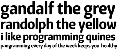
And here’s where I start to get all radical: I decided to do one of my excercises and quickly digitized the Arrighi page I had. It’s a very loose digitization because the Arrighi sample has many imprecisions and details I didn’t quite like, but the general idea is there. I called this excecise Gratie: I started this morning and at the moment it’s a very blobby calligraphic serif study, with just the letters in the Arrighi page. Maybe I’ll expand the character set, if I find a way to tame the rampant irregularities. See the top of this post for a Gratie sample. I would love to see the Missale Romanum before going further with this excercise, though, because starting from an incomplete sample doesn’t seem like a very wise idea.

Update: here’s a reworking of the lowercase so far, I removed a lot of weight, tamed many irregularities, fixed details and generally parted ways with the most problematic (to my eye) shapes in the old version:

gratie updated

A comparison of the weight loss in the lowercase a:

gratie a, before and after

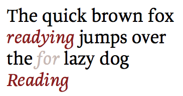
In other news, I finally received my unconditional offer from the Reading university, which means they received my IELTS test results. I’ve been thinking about a tentative departure date for the 22nd of September, but I’ll need to see if my room is ready by then, which doesn’t seem to be the case at the moment. We’ll see I guess.